Amanda MacMillan Wellness
Services:
BRANDING
Social media
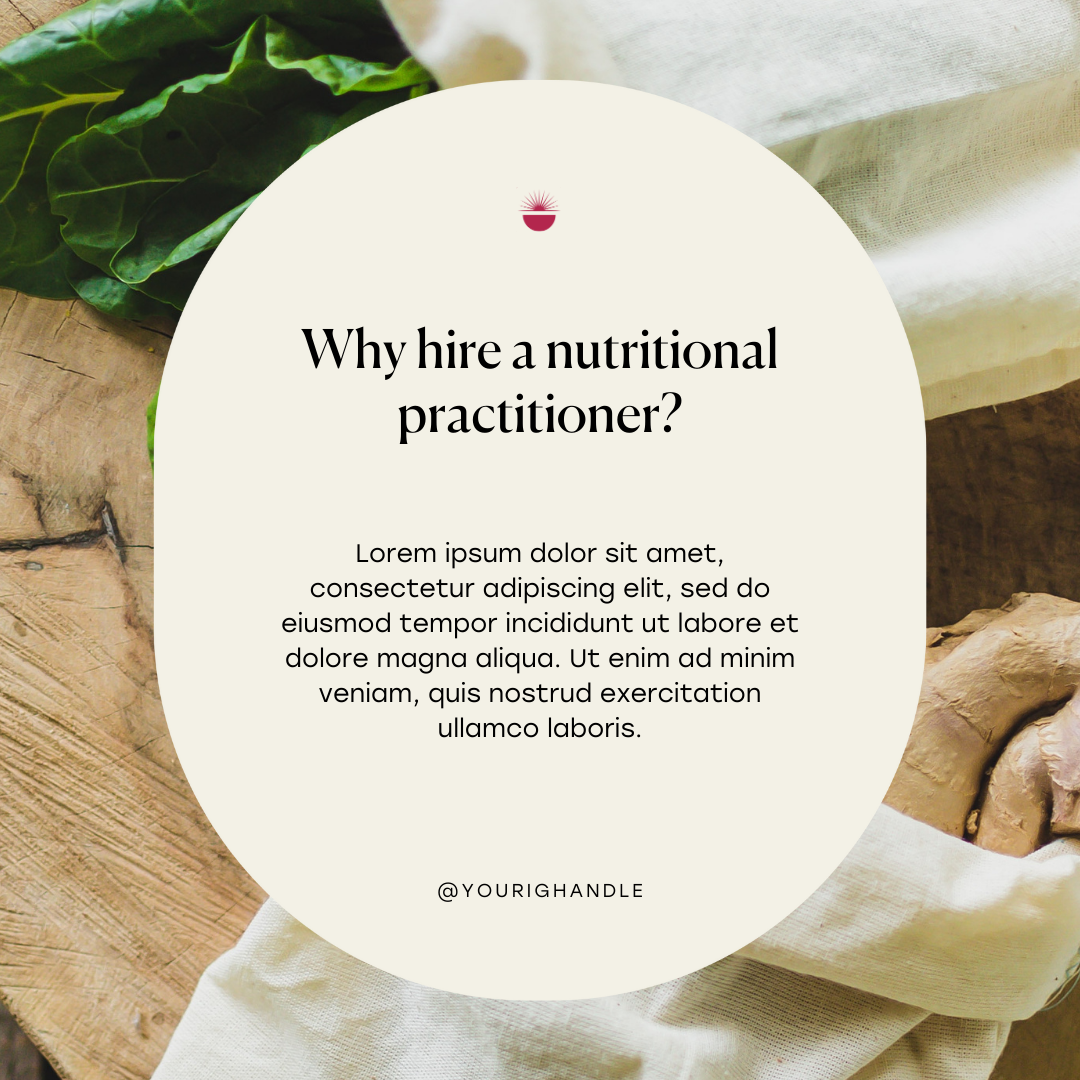
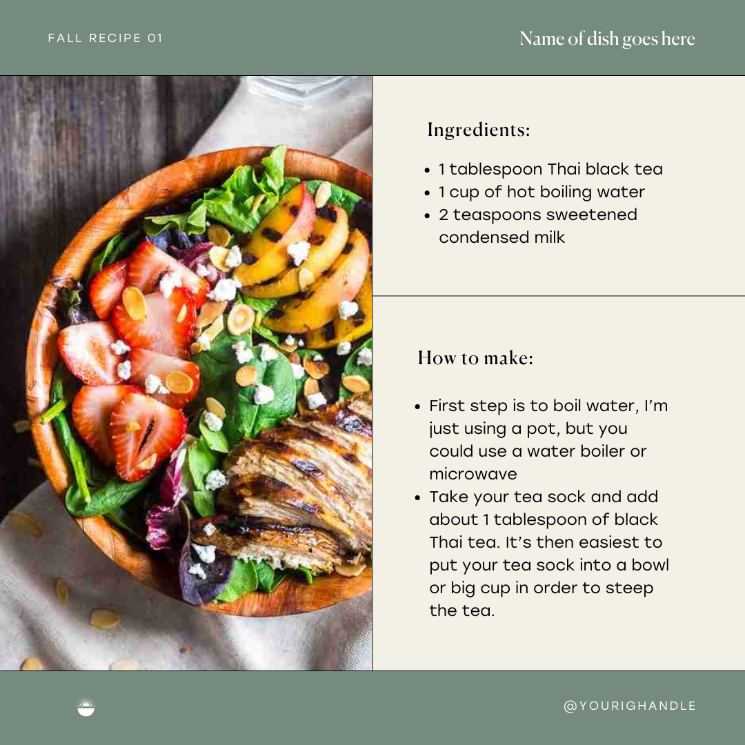
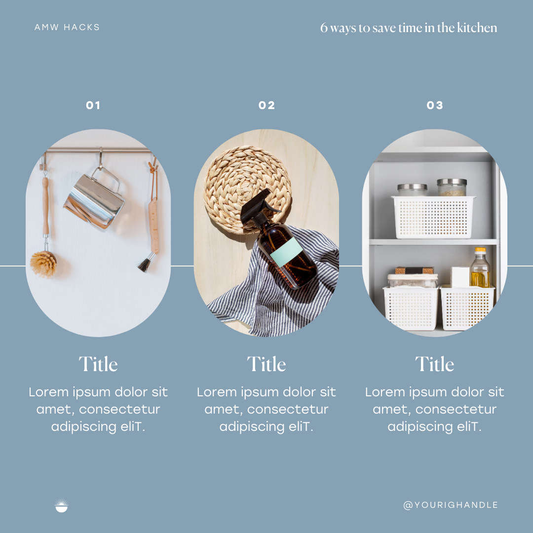
Amanda MacMillan is your new BFF. Amanda MacMillan Wellness (AMW) is a holistic health business that supports chronic health conditions to women who need help. Amanda helps these women heal through nutrition and education. We worked together on building the brand to embody Amanda’s personality - Joyful, hopeful, calm, nurturing, holistic, and you can really feel that throughout with the colors we went with, font choices, logo design and stock imagery. Scroll through to see her vision come to life.
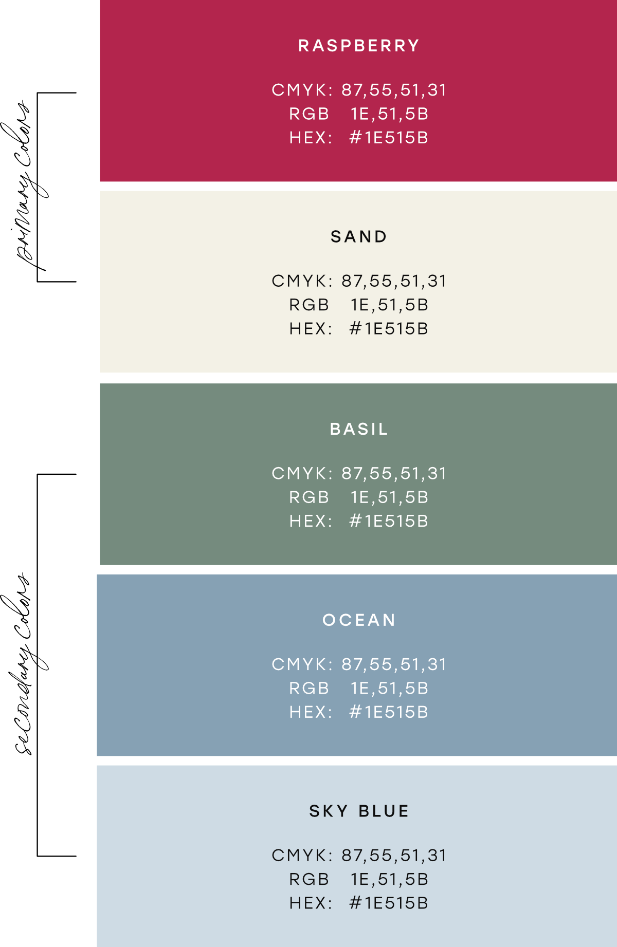
Color Palette
Primary Colors:
Primary colors help consumers to quickly identify a brand. These are the core colors of the brand. Raspberry stands for importance, excitement, and femininity. The color sand evokes health, simplicity, and optimism.
Secondary Colors:
Secondary colors highlight and compliment the primary colors and helps with recognition and consistency. Basil evokes stability, grounding, growth and a connection to nature. Ocean creates security and trust. Sky blue exudes tranquility, comfort, and openness.


